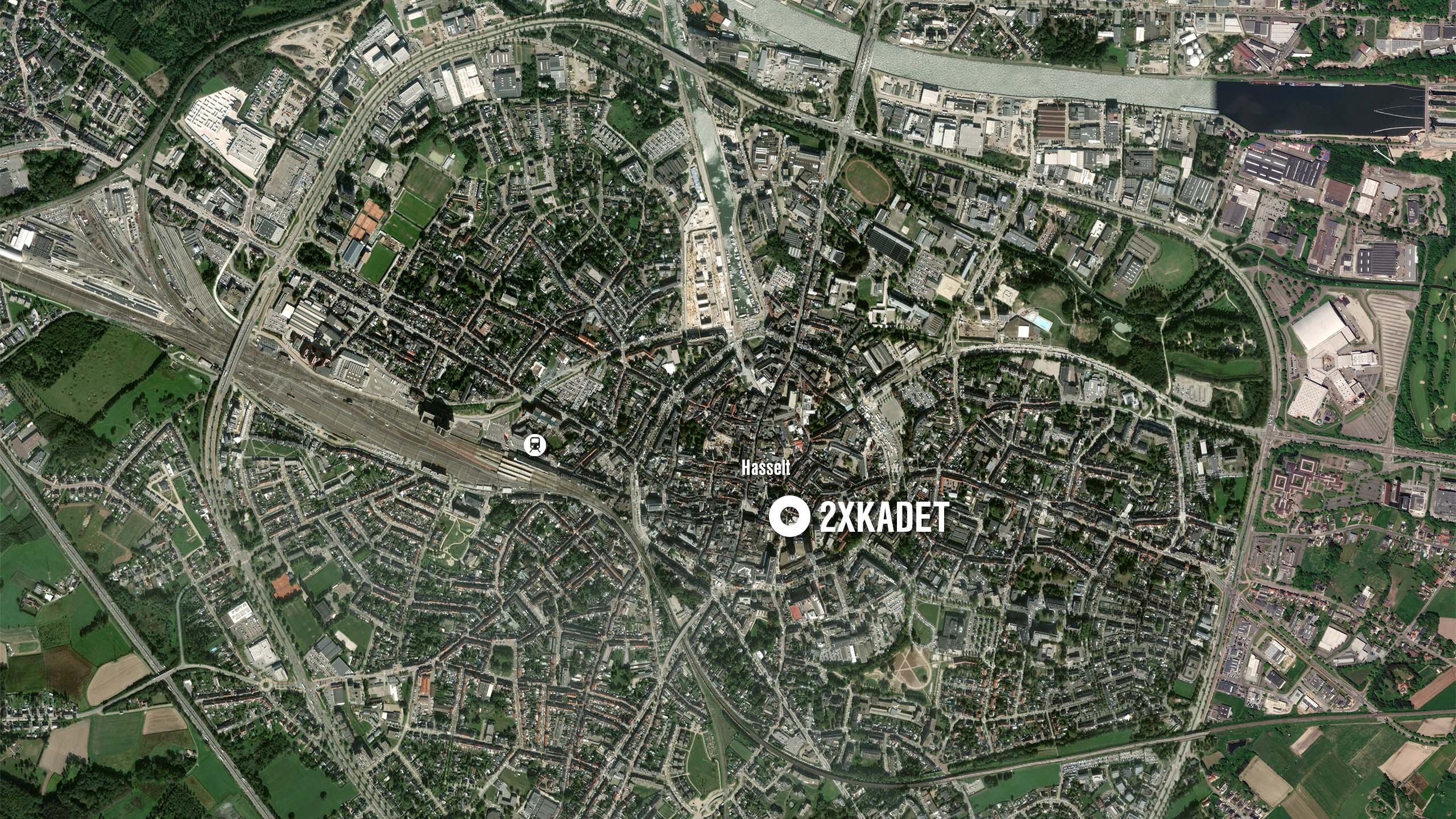
- Location: Hasselt
- Program: Kids Fashion Store
- Area: xxxx m²
- Year: 2018
- Status: Realized
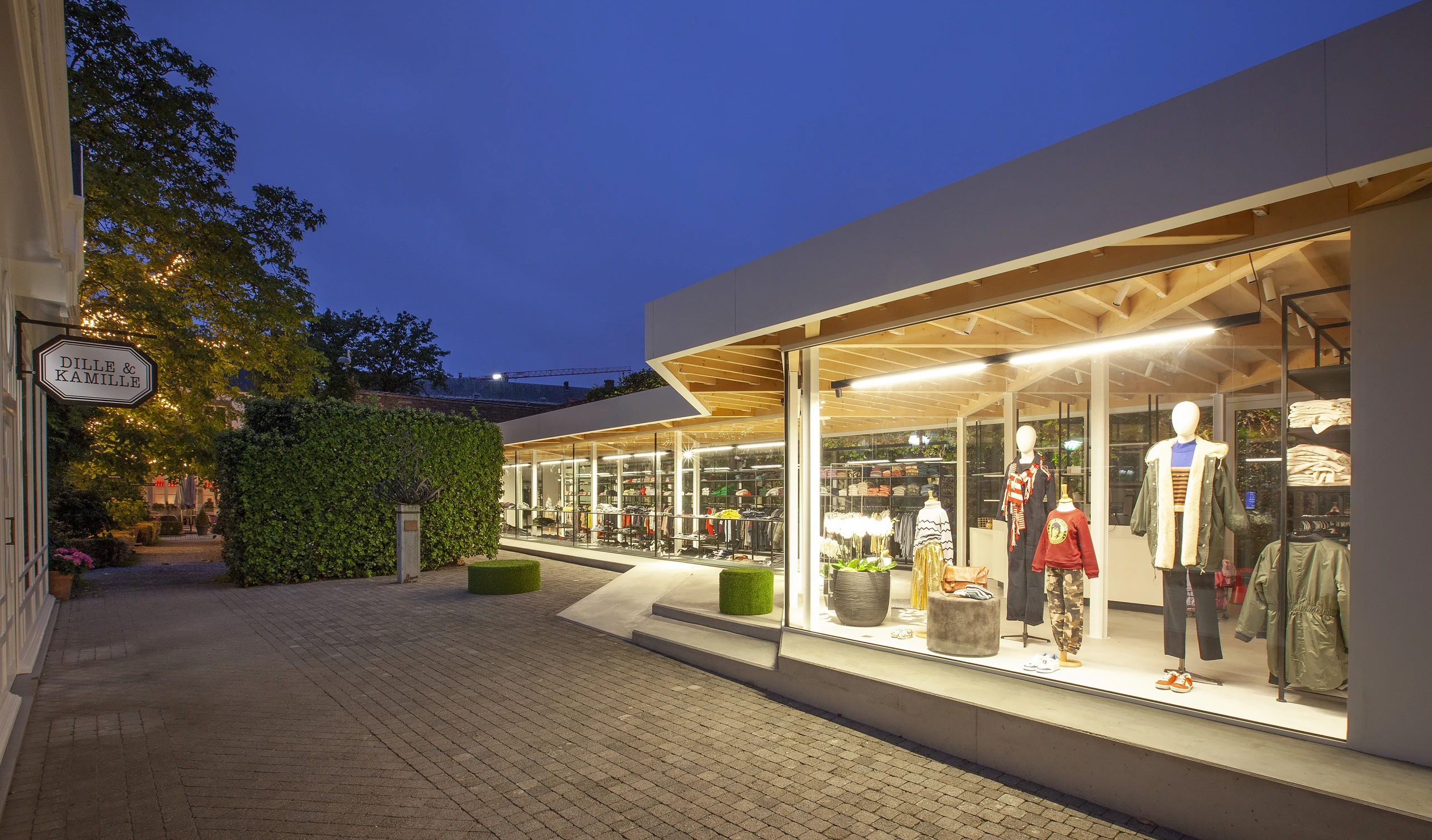
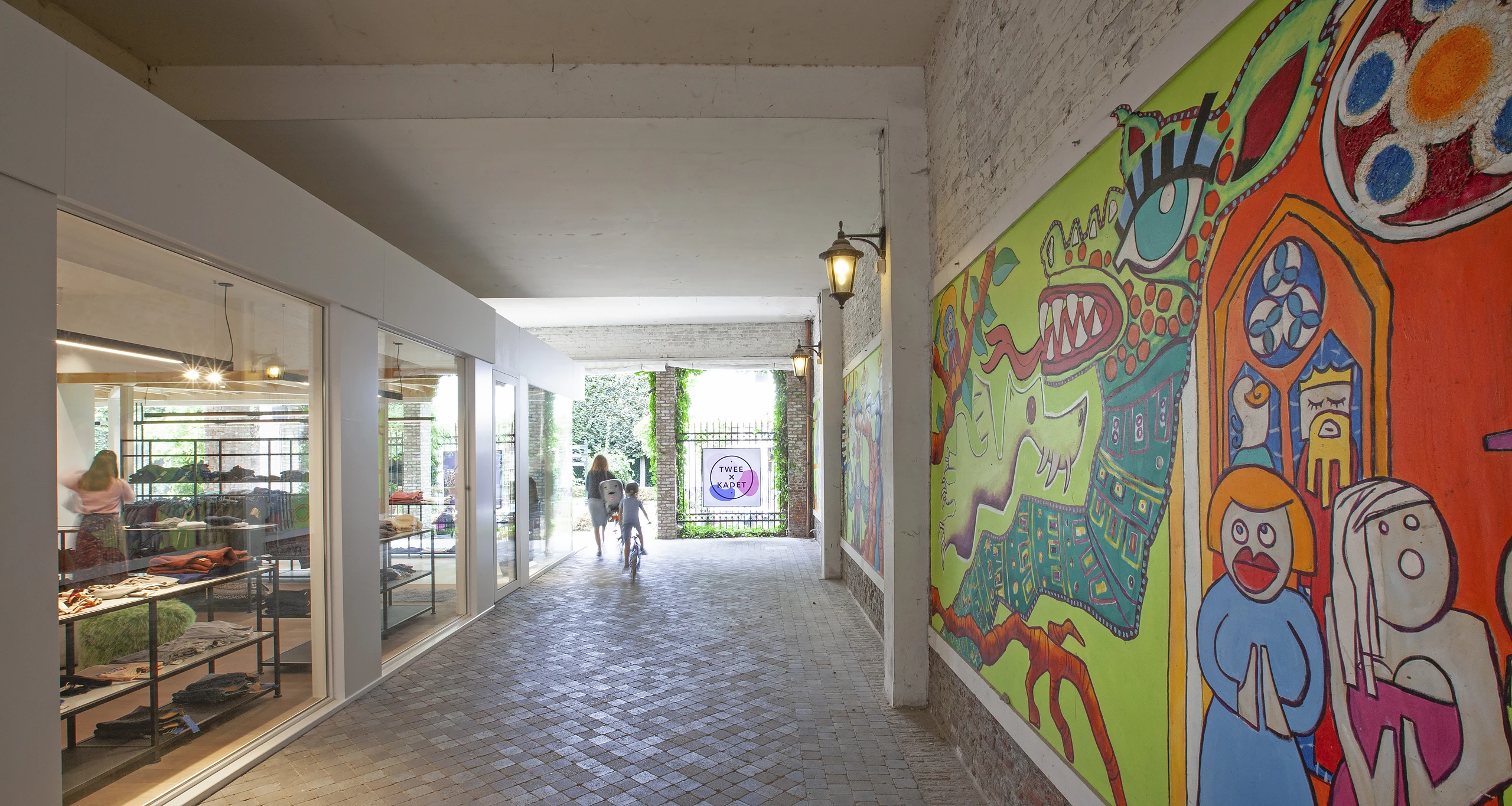
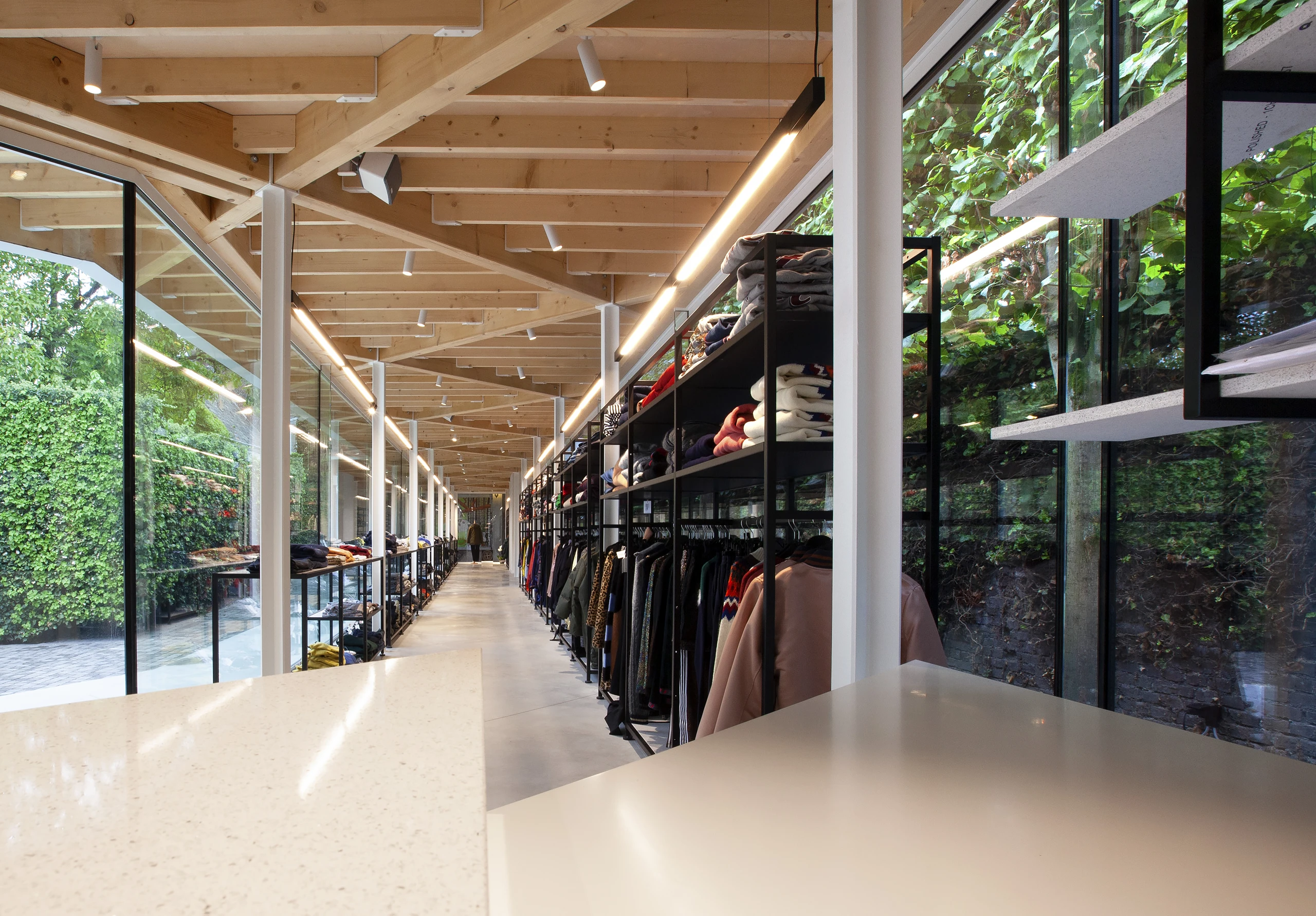
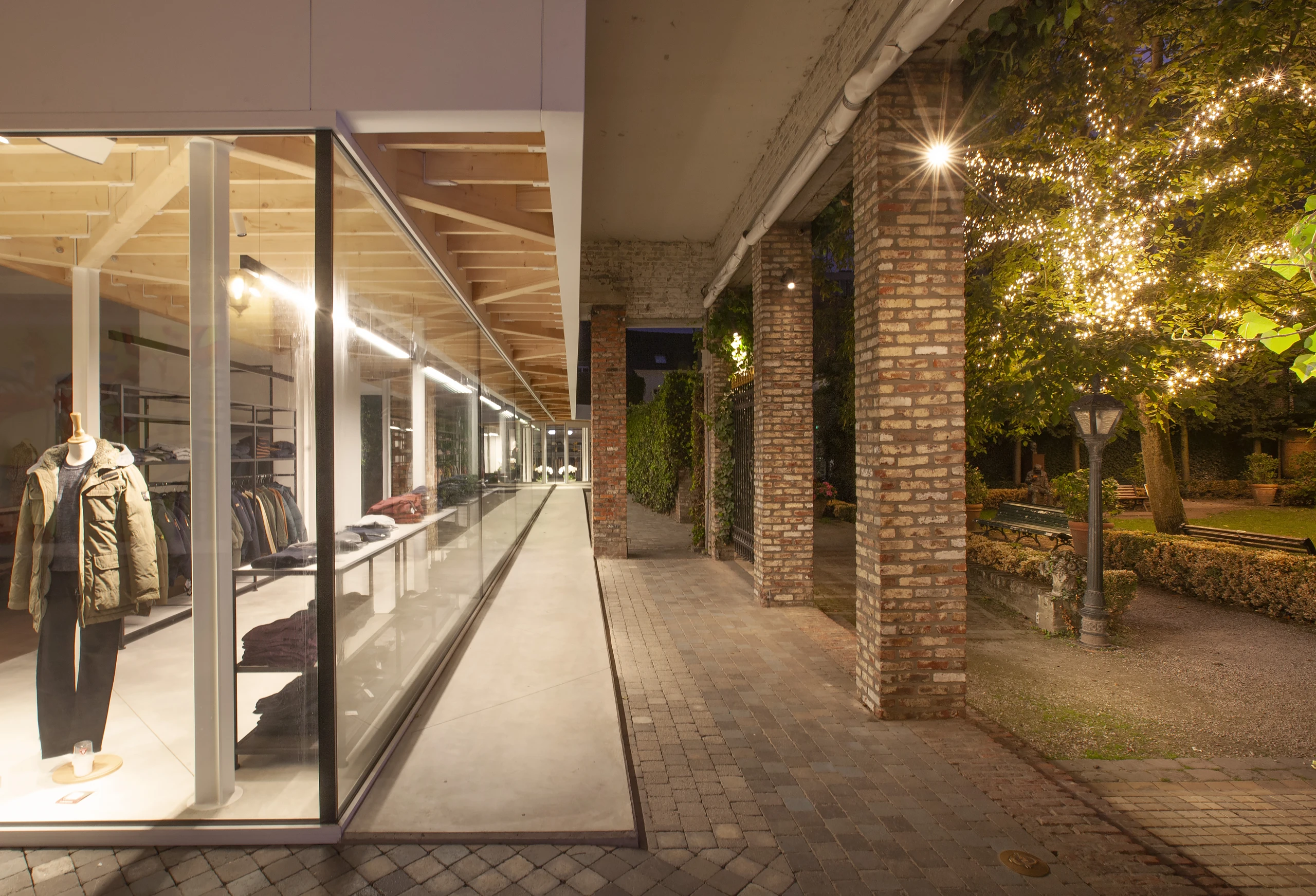
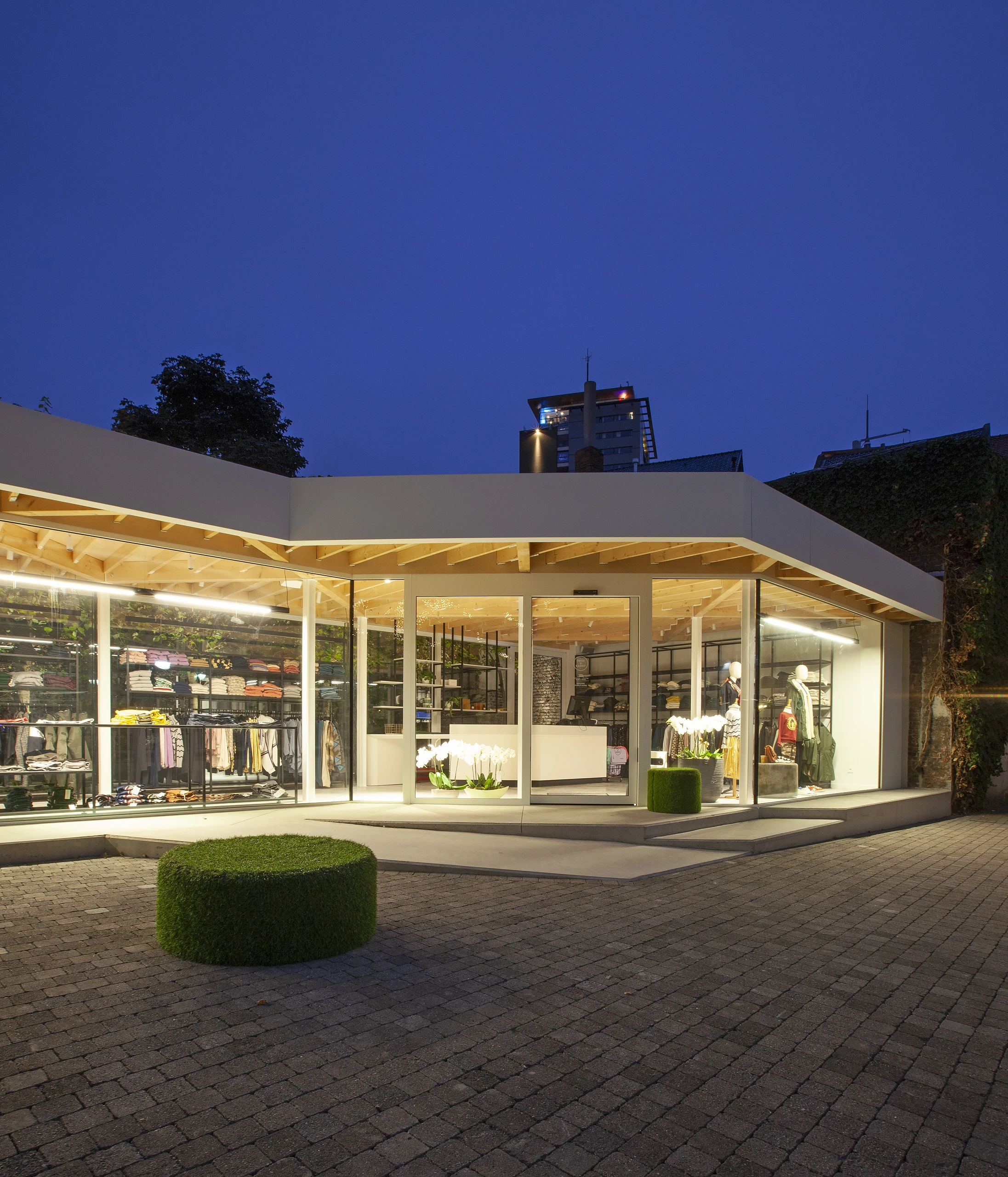
In August 2018, the Hasselt children’s clothing store 2X Kadet moved into Kadettensteeg. Part of the former shoe shop was demolished there and replaced by an elongated new volume. Thanks to the large windows and ultra-clear glazing, the sleek interior and the beautiful clothing collection come into their own. 2X Kadet is a household name in Hasselt and the surrounding area. Despite its continued success, the owner had been brooding on a substantive change for some time.
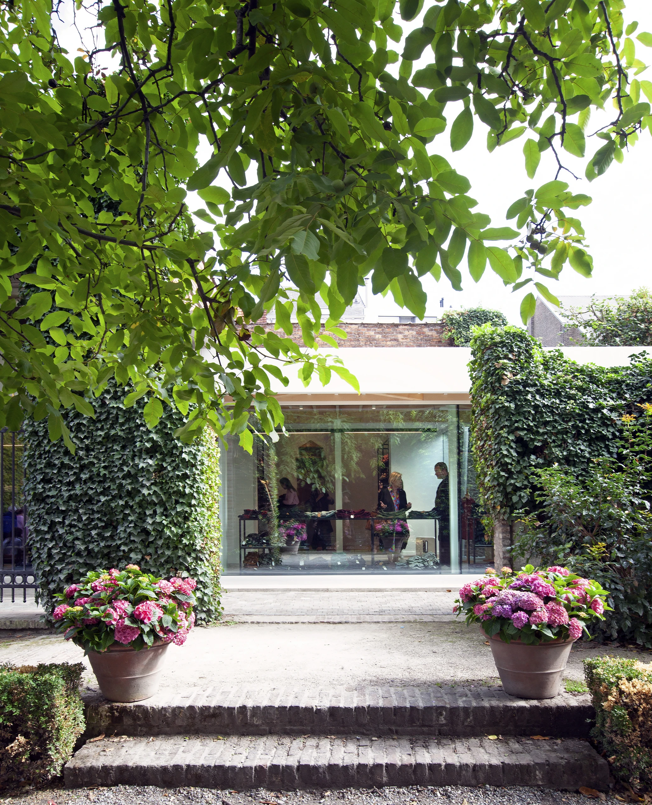
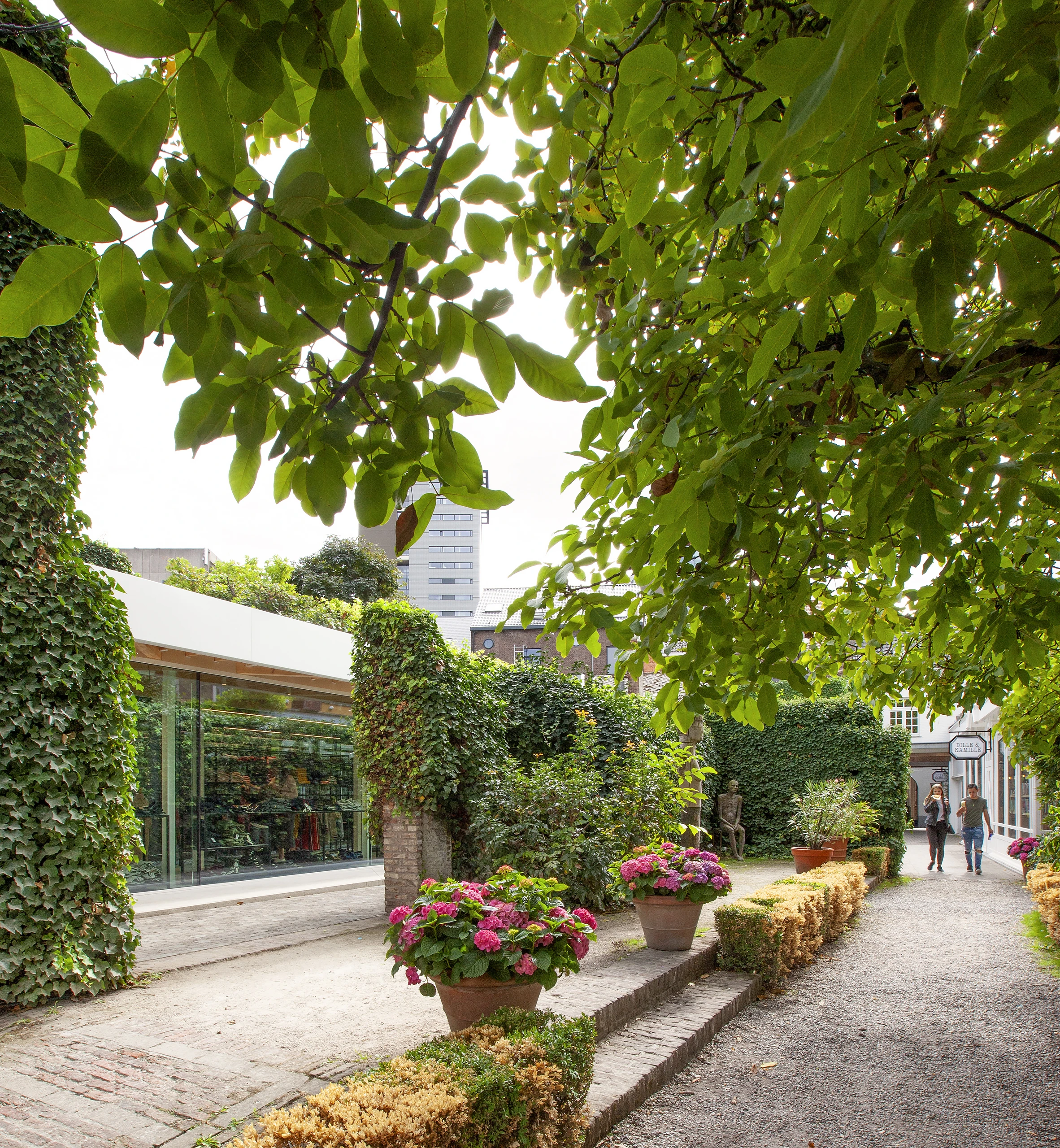
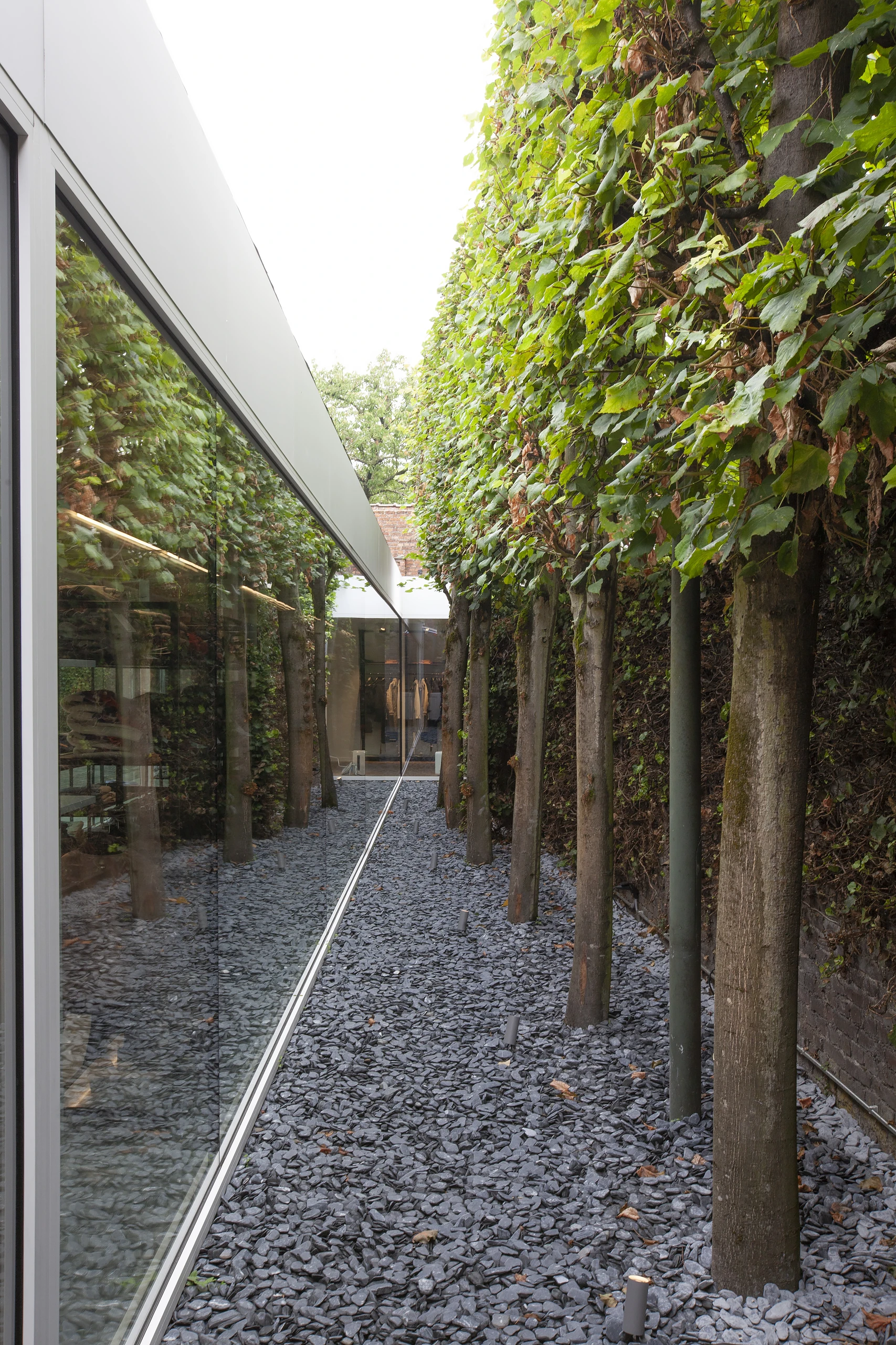
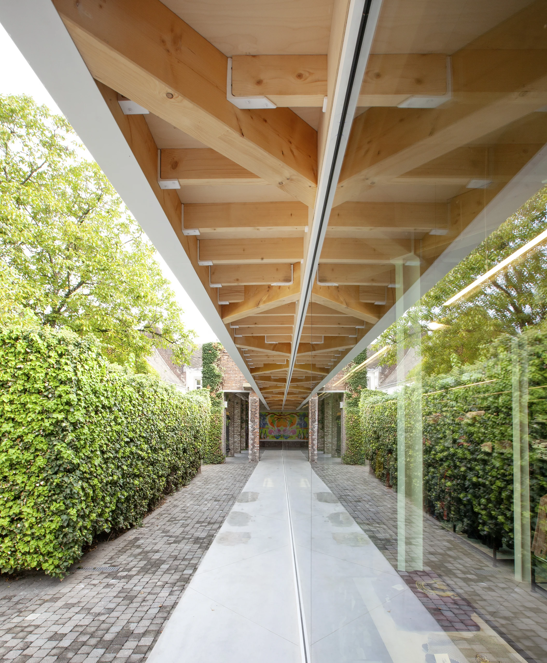
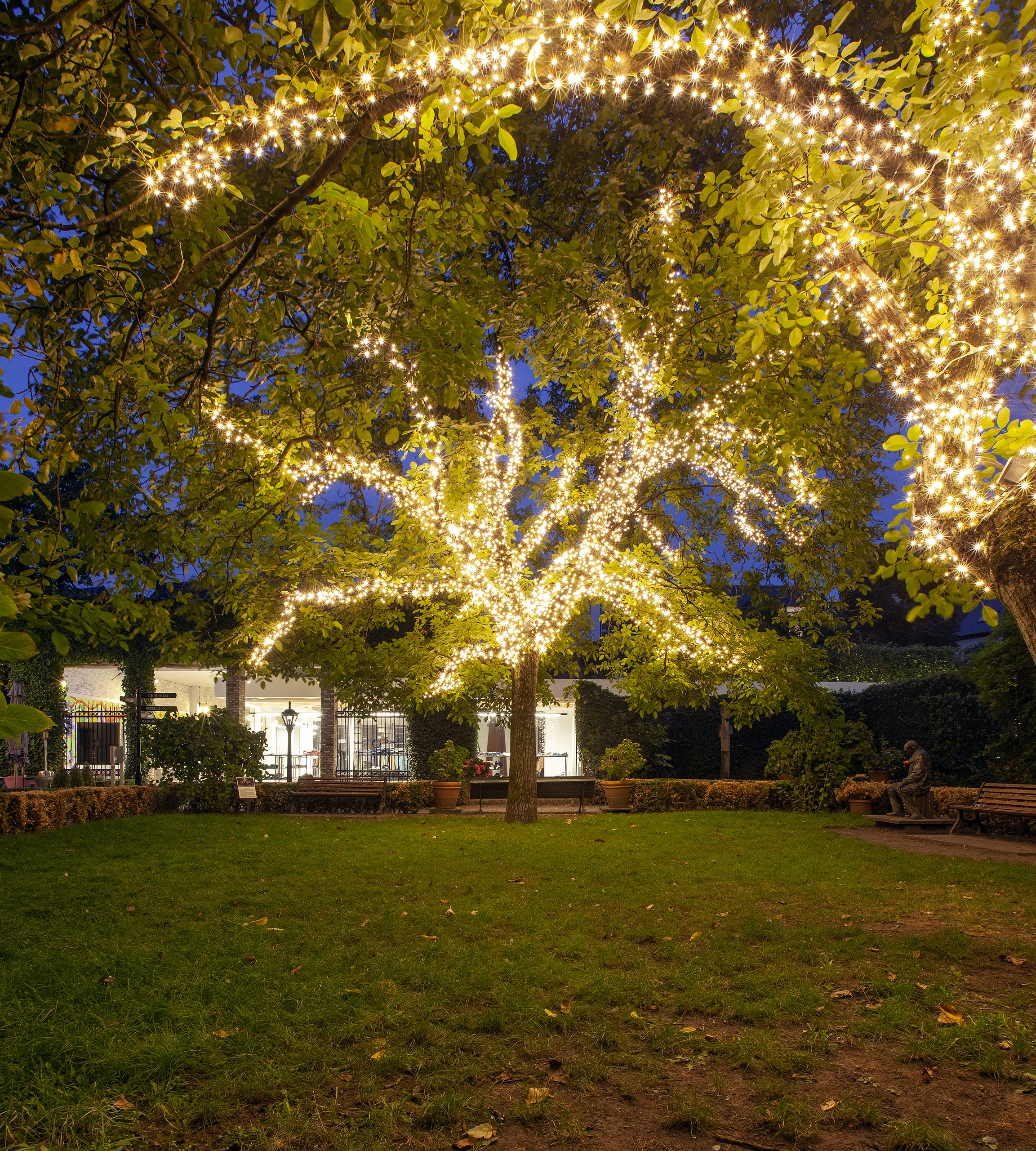
The choice of Kadettensteeg as the new location is by no means accidental. Over the years, this unique inner area has become one of the hidden treasures of the Limburg capital. The spatial and visual impact of the new clothing store had to be minimal. The transparent new-build volume is optimally integrated and has a pavilion character so that the characteristic trees, benches, and statues in the inner alley still come into their own. Initially, we thought of a beam-shaped extension, which would then be built against the partially demolished shoe shop. Afterward, an entrance zone was added, which is slightly outside the straight plane of the beam volume. This made it possible to intuitively distinguish the entrance and the cash registers from the actual store, which certainly improves the readability of the whole.
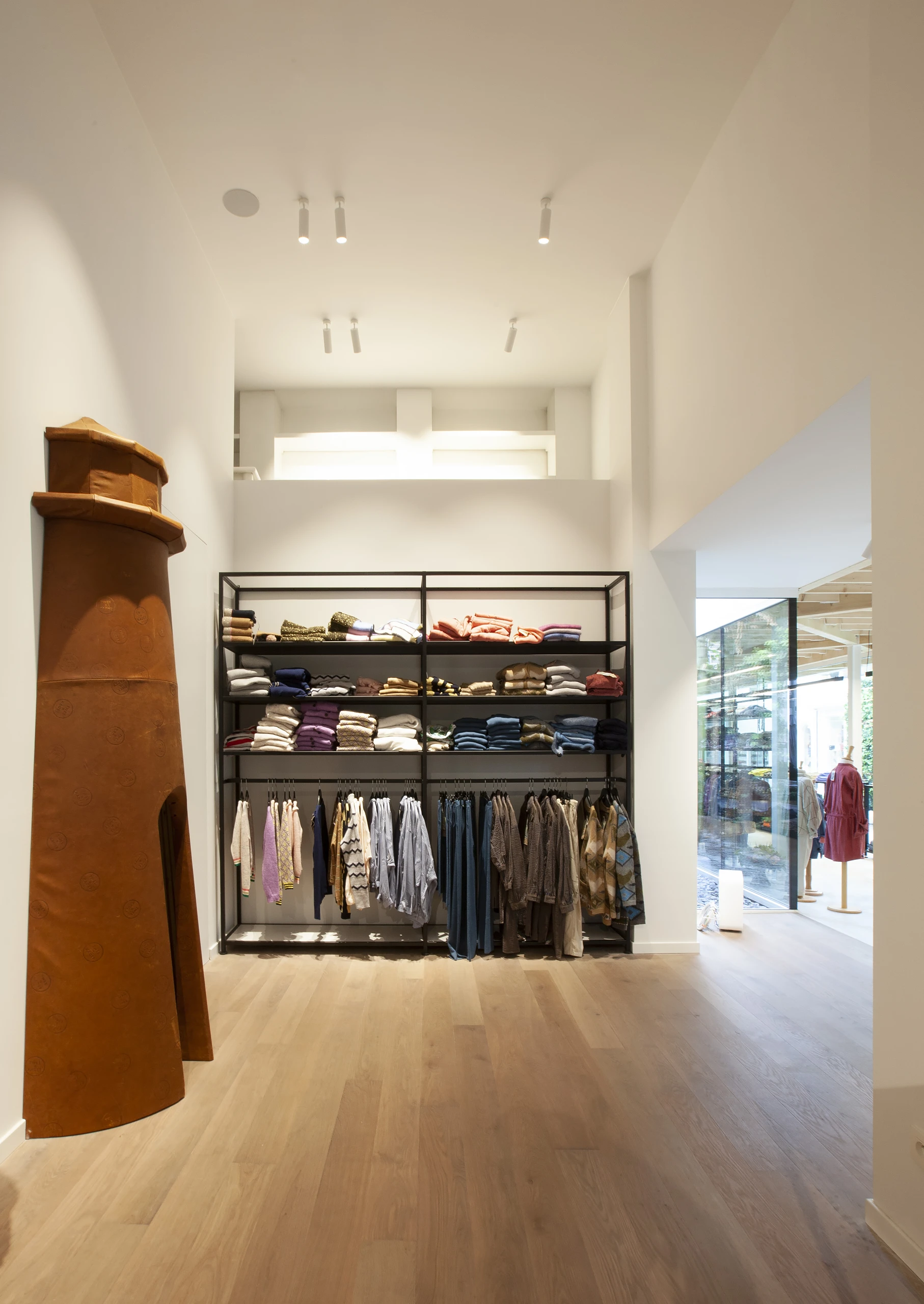
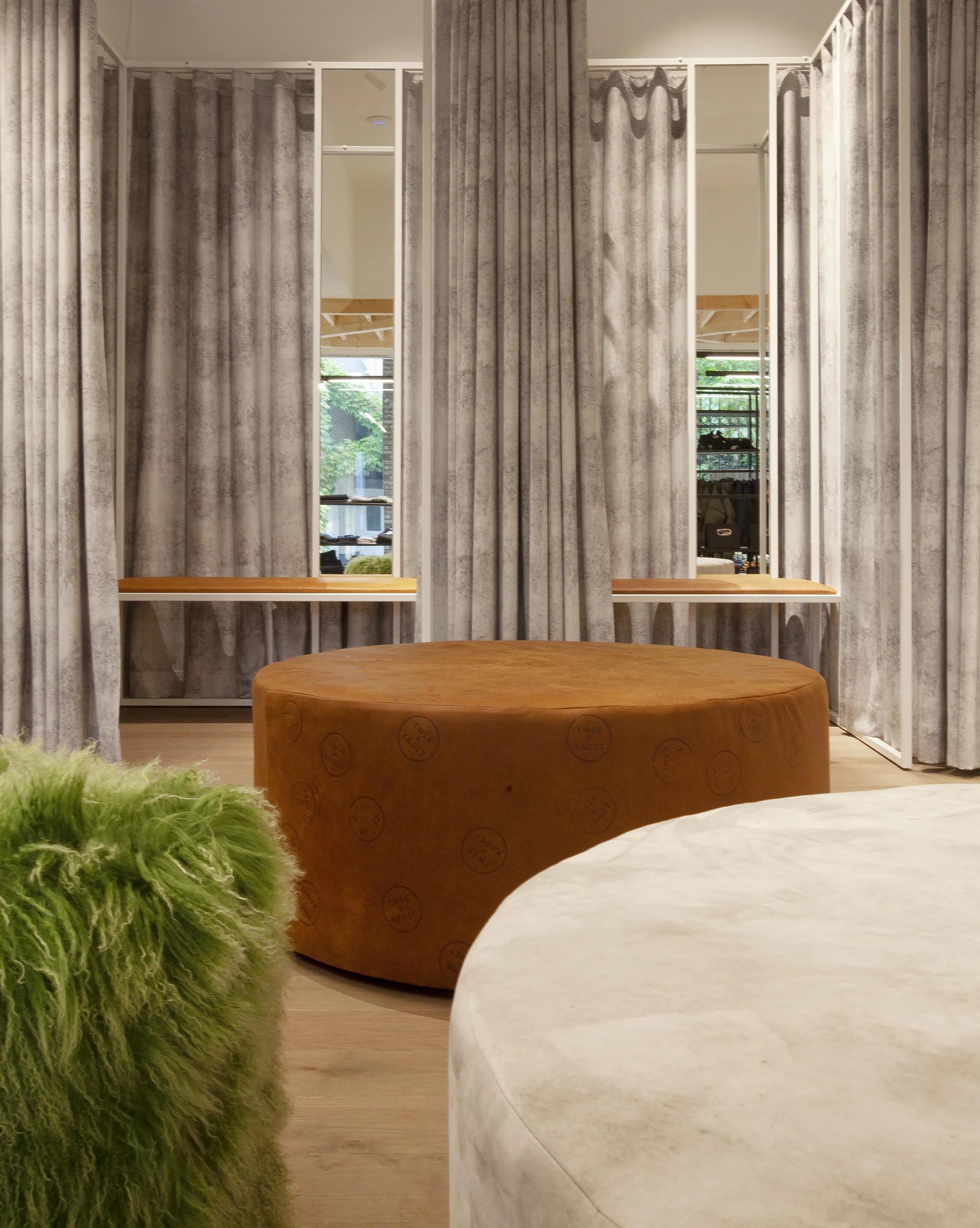
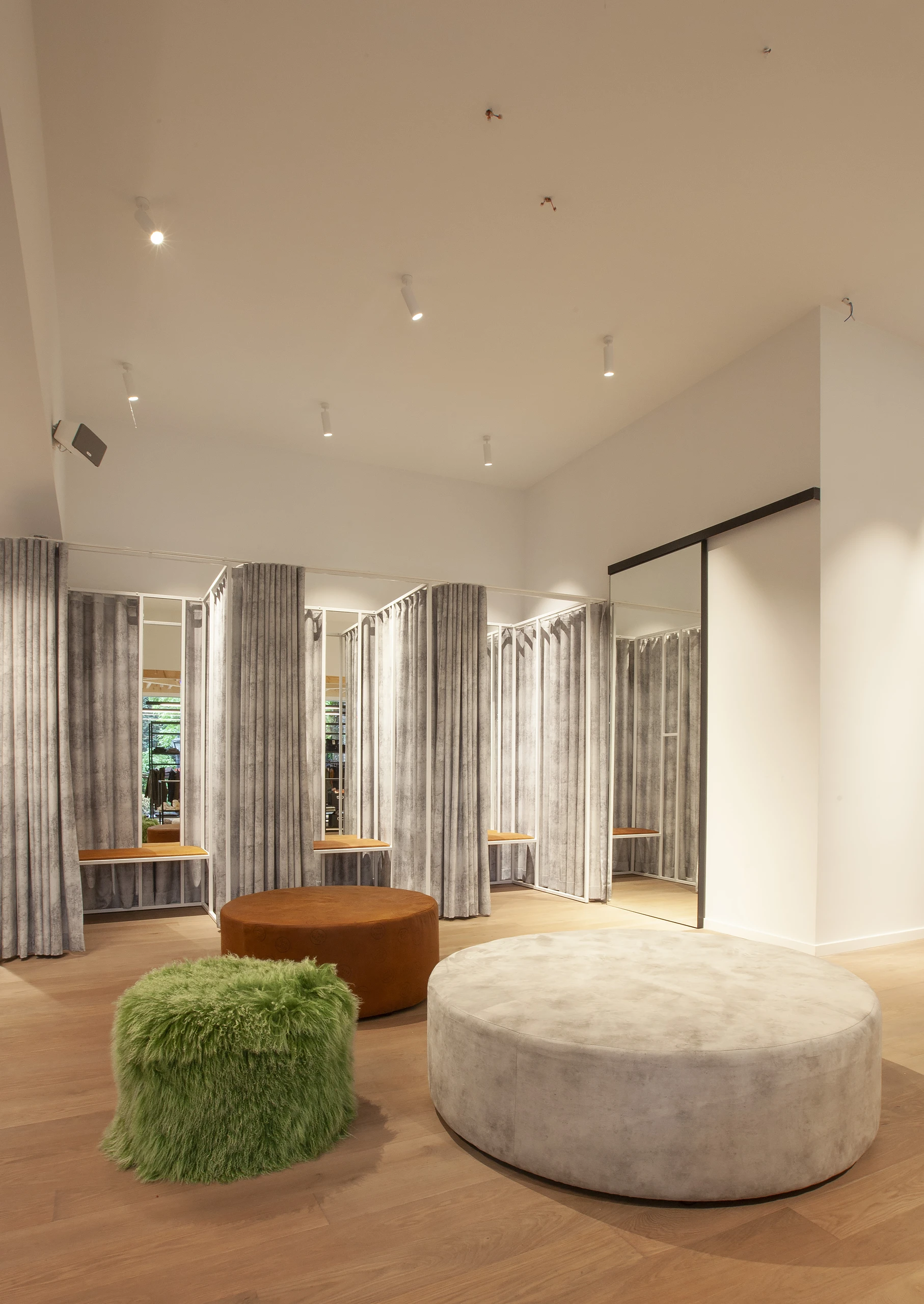
The new-build volume flows seamlessly into the remaining part of the former shoe shop, which has been thoroughly renovated to obtain a homogeneous view. Still, some subtle details reveal in which zone the visitors are. For example, the new-build part has a poly concrete floor, while the existing part is equipped with a parquet floor. We have been given a lot of freedom in the design of the whole. The only requirement was that the “child image” of the previous store had to be discarded. After all, 2X Kadet is now also targeting young adults and even has a (limited) adult collection. This calls for a more hip look, which we have created in a minimalist way with black-and-white contrasts and wood accents. The clothes and poufs in the fitting rooms provide the necessary color.
What is also immediately noticeable is that the whole is very open and transparent. It was the main intention to put the clothes in the spotlight, and not so much the building. The slender, cross-shaped steel columns that support the wooden ceiling and the roof structure above are inspired by Mies van der Rohe. The panes go from column to column and therefore have a width of approximately 4 meters. Not an obvious size, but at UAU collectiv we like to look up the limits of what is possible and take them to the edge.
